
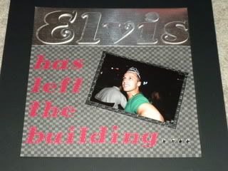
Background paper is a DCWV black and grey check, Elvis is cut from a shinly silver DCWV and the red letters are cut from a SU paper. Under the picture there is Core'dinations matte that is cuddlebugged with the checkerboard folder that was an OMC exclusive that I sanded down. The picture is attached with ATG tape and some cool paper clips.
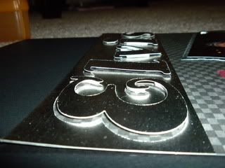
The ELVIS title is cut with Hello Kitty font at 3 1/2". Since none of the letters have spaces inside I could use both the cut mat and the letters--SO I DID.
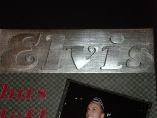
I pop dotted the letters and moved them about 1/8" to the right when I placed them on the layout. The base layer peeks through and you get a pretty cool effect! Here is a detailed shot
To finish the layout off--I took my white pen and did some 'stitching' around the letters and added a little bling at the end to tie back to the crown he is wearing (which was taken from the birthday girl a few tables over)!
Hope you have a great day!
Bryan


I really like how the ELVIS looks like metal! I'll have to try that with some of the motorcycle pictures I keep putting on the bottom of the pile.
ReplyDeleteThanks for sharing!!
~Kristina
this is so freaking funny!!! The layout is adorable! That Hello Kitty font is PERFECT for this project!
ReplyDeleteLove the silver paper!
ReplyDeleteOk-To see it in person was probably the best. (Elvis that is) I love how you cut the letters and the paper behind the paper. I must do this.
ReplyDeleteLove it
HAHAHA great page! I can't believe I have NEVER used my Hello Kitty Font!!! GASP!!!!!!! Love how you used the postive and negative! CUTE!!!! and on the funny drunken friends note...i have a friend that we start calling Shenaynay (from the show Martin) after she has hit the sauce a little too hard! HAHAHAHA
ReplyDelete{hugs}nikki
That was a great idea to pop up the letters and move them a little. It is a great effect!
ReplyDeleteLove the layout and the story behind it is just so funny!!! :)
ReplyDeleteI love the way you popped up the title! Looks wonderful and I bet that party was soooo much fun!
ReplyDeleteThat story is truly funny, love the metal look & the stitching around the red letters.Very nice touch.
ReplyDeleteRosebud
That is AWESOME Bryan!!!! :) Love it - love it all!
ReplyDeleteshut the front door, i have a friend that the same thing happens too. this is too funny. thanks for sharing with us
ReplyDeletechriswooten57
mcwooten1999@carolina.rr.com
love the silver paper and love that font from the HK cart...very creative; may have to find a friend with that cartridge :)
ReplyDelete