It's Friday and I am back at work after two day of being shut up due to strep! I hate being sick. Not back to 100% but I have to get back to work!
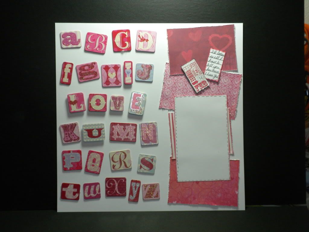
I have a fun single page layout to share with you today.
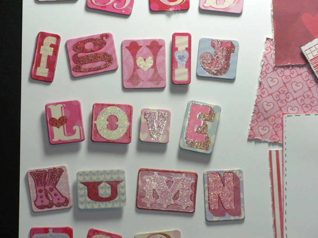
The letters are from K&Company as are the papers used along the side.
As I arranged the letters I wanted to hide a message of sorts--so I used pop dots on the I, Love, U so that it stood out .
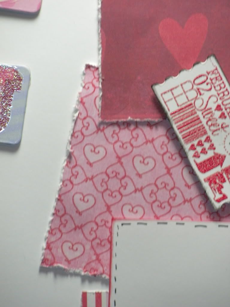
I used a distressing tool on the paper edges to give the pink and red papers a bit more of an edge. I like how these papers with the rough edge and a black and white photo will tie together! The photo could be holding hands, a kiss, the back of to heads a hug in shadow--the possibilities are endless.
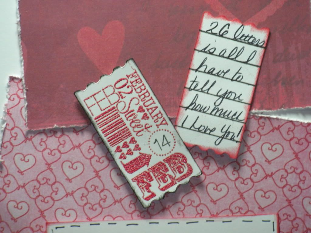
So I used the Art Philosophy cartridge and the stamp set I gave away last week for the tickets. The February ticket was heat embossed with ruby embossing powder and edged in black. The journal ticket I used my own hand writing and it says, "26 letter is all I have to tell you how much I love you!"
Leave the comments to ensure you get the best chance to win this weeks stamp giveaway. Today there were two posts here on ScrapGuy and my post over at Pink By Design and those comments count as well! Winner will be announced on Sunday along with a guide for the week.
make it a great one-


What a fantastic LO and I love how you have that hidden message how ever..clever R U :)
ReplyDeleteHey Bryan...so sorry you've had that darn strep t/o of yourself and here's to feeling better!
Hi Bryan! Hope you are better soon. I love the letters and how you did the special message. Thanks for the chance to win!
ReplyDeletegetting sick is the pits, but, you do get much needed rest that you probably wouldn't take. i absolutely love this lay out and you have great handwriting
ReplyDeletesnojo5@sbcglobal.net
That's a very cute layout, love the letters. Feel better soon.
ReplyDeleteGreat layout.
ReplyDeletecraftymom205 at yahoo dot com
Just darling. Love the colors and how you arranged it all so perfectly. Thankyou teachermom5@gmail.com
ReplyDeletePretty colors...I like the distressed edges.
ReplyDeleteI love the layout! Great job! Hope you feel better soon.
ReplyDeleteWhat a sweet layout!
ReplyDeleteRoxanna
roxxscott at g mail dot com
Love your hidden message LO!
ReplyDeletewhat a cute idea. tfs.
ReplyDeleteGreat idea for a layout, Thanks for sharing.
ReplyDeleteLove the colors and the distressing! Great job!
ReplyDeleteWhat a fun LO Bryan! I think the colors will look great with a black & white photos as you suggested. Hope you are back to 100% soon!
ReplyDeleteShellee
Adorable layout. TFS!
ReplyDeleteLove the layout and kudos on the grat new blog design!
ReplyDelete